4.12.2016

party // donut ever grow up


donut party shirt by lilthreadzclothing on Etsy


While I'd like to spare you the cliché ramblings about how fast this year has passed, I just can't. Sorry. I feel like I had a newborn five seconds ago and I could just melt into a puddle on the floor about it. 

Being a mom is weird. This love is powerful, beautiful, and painful. It's terrifying to love someone so intensely from the moment you knew they existed. (And makes me appreciate my own mom in a whole new way.) Each milestone has been cause for major celebration, but they're also sprinkled with some varying amount of not-yet-please. It just happens that the first birthday has more not-yet-please than I'm used to. 

All these bittersweet emotions helped lead me to Morgan's first birthday theme, Donut Ever Grow Up. From invitations, to event day, my plan was to deck. it. out. Donut explosion. (Read: I needed a major distraction from the milestone at hand.) I also borrowed an idea from Mushybooks (side note: best baby books ever) and decided to ask our guests to help me create a time capsule to be opened by my son on his 18th birthday (whoa, not-yet-please). We mailed out prediction cards with the invitations and also asked for items for his capsule instead of birthday gifts.

I was really excited about the time capsule, but seeing how creative our friends and family got with their notes and items made me even more excited. On his 18th birthday, he will have letters with advice and memories, and all kinds of meaningful heirlooms to go through, and he will know how loved he has been since year one. In the meantime, I will happily pack it all away and hope that birthday comes around as slowly as possible. 

Donut Birthday Invitation in my Etsy shop
custom time capsule cards available upon request
Donut Birthday Greeting Card in my Etsy shop
Despite the birthday boy having a surprise ear infection, the party was a success! I channeled my mom-stress into the decor, and had so much fun coordinating everything back to his invitations. Here are some more photos and details from the party:


prints by social print studio
Letterfolkco
Printable banners by NCC available upon request


treats from our favorite, Slaton Bakery
the best kind of tower is a donut tower
donut pocket tees from wellsaidcreations on Etsy


3.30.2016

process // drive-in anniversary

Recently, I had a client approach me to design an invitation to her parents' 50th anniversary celebration. The theme? The drive-in movies. Why? Because that's where her dad proposed all those years ago. She told me she even planned to do a surprise outdoor movie at the party of the same film they watched that night. Can it get any cuter? I think not. (Actually it can though because their names are Larry and Lou. Like, seriously how adorable.) 

I'm all about a well-thought theme. The thing about themes, is that it's easy to fall into something cliché. This idea was too cute, so I wanted to do it justice– no popcorn clipart up in here. Instead, I took inspiration from vintage film titles.
img src: google image search 


Fifty years is BIG LEAGUE. I've made it three, and I think anyone who can make it 50 years probably should have an actual movie made about them. That's a lot of laundry, y'all. 

So maybe Larry and Lou don't have a movie about their lives (yet), but we can pretend. And so the final product?


Love. Might crash the party. (justkiddingoraminooneknows) 

click here for my Etsy shop
If you also have an adorable party idea and want some custom invitations to match, I am AVAILABLE. (Precious old couple names not required, but VERY appreciated because I like to scream about them to my husband and anyone else nearby.) You can visit my Etsy shop and send me a message to get started. 

I promise to be as enthusiastic as you, if not more so, about all your party ideas. <3 


2.04.2016

how to // handle save the dates

Perfect Circle design by nccreative on Etsy
Save the dates. They're the opening bell to your wedding season. They're the reason for engagement photos. They say "hi, we're cute and we're going to get married, wanna come?" Yes, I would love to. Save the dates are a major milestone of wedding planning. I jokingly tell some clients, "they're being printed, now you HAVE to get married." (I'm a fun girl.) But really, they're your first major announcement to the world that this wedding is going down, and so that makes them a pretty big deal, right? 

As with most "big deals" save the dates are the source of some questions. I do a lot of save the dates, and I get a lot of questions. Mostly about logistics, so I thought I'd simplify a bit and answer the most common ones. Here we go:

When should I mail my save the dates?
The general rule is six months in advance. However, for shorter engagements, three to four months is plenty of notice for guests to pencil in your big day.

To whom should I mail save the dates?
Everyone on your final guest list. This, of course, means that before you can send them, you have to finalize your guest list. Make sure you get your guest count right where you want it, and make all your cuts prior to sending any mail. There’s nothing more awkward than receiving a save the date, and then not receiving a formal invite because you were cut from the guest list. (Ouch.)

What information should I include on my save the date?
Think of your save the date as a casual notice of just that– the date. Guests only need three pieces of information until the formal invite comes: Who is getting married, on what day and in what city? 

If you have a wedding website, it might also be nice to include that for eager guests looking for accommodations or registry information. The key is to keep it concise so that your design isn’t cluttered and your photo can be the real star. Speaking of which...

What photo should I use for my save the date?
In general, one professional, tasteful photo that includes both of your faces is a perfect choice. Of course, there are exceptions. I’ve seen abstract shots of couples dancing or holding hands that end up looking fabulous... but for the most part, you want to play it safe. 

Why just one: Although it’s tempting to share all your favorite engagement shots on one card, two or more photos tend to clutter up a design. Keep it simple and if you really want to feature multiple photos– ask your printer about doing different versions of our save the date instead.

Why professional: Photos taken by a photographer will be higher quality and they will print better, leaving you with a perfectly polished final product. Cell phone photos will always turn out fuzzy, and selfies will always look well, like a selfie. 

Why tasteful: This one is pretty self explanatory, but since photographers usually do some sappy make-out photos, I think it’s important to heed against sending any of these directly to everyone you know and expecting them to hang it on their fridge.

Why both faces: Because your family wants to see you and his family wants to see him. Also because if we’re being totally honest, just your name and a photo of your hand might not jog Great Aunt Martha’s memory as to whose child you are.

Does my save the date have to match my wedding suite?
Absolutely not. Save the Dates are just a fun, casual way to announce your big day. There is no need to stress over choosing a design that will coordinate with your formal invitation suite. 

How should I print my Save The Dates?
If your designer offers print services, (I do!) it is best to order it all from the same place. This way, you know the files will be properly handled and nothing will turn out unexpectedly wrong. 

If this is not an option, use a professional print service– either online or by searching for a locally owned print shop. Beware of chain store printing, as their equipment, paper quality, and employee skills are not as great. There is nothing that makes a well-designed save the date more sad than a bad print job. Don't make your design sad.

Should I mail my save the dates in envelopes or as a postcard?
This one is totally up to preference. Generally, using envelopes ensures your guests receive a clean, undamaged copy of your save the date. It is also slightly more formal than a postcard.

Postcards tend to be more budget-friendly– requiring cheaper postage, and saving you the cost of envelopes. Disadvantages are that postcards can sometimes (read: almost always) be damaged going through post office rollers, or dirty from exposure. 


Most importantly: never, ever abbreviate "save the date" because no one wants an STD in the mail. 

1.15.2016

life // comparisons

image source


It's been a hard week. It's been hard for no particular reason and for all reasons. Nothing is all that wrong, and yet, everything is wrong. My grandmother, KK, says, "when it's everything, it's really just you." My friend, Rachel, says Mercury is in retrograde. I'd rather blame Mercury than myself, but KK is probably right. 

I really try not to deem my life as "stressful" all that often. I realize that I am lucky to have what I have and that many people aren't as fortunate. I think this reluctance is a good thing, but also a bad thing. I feel like I don't deserve to be stressed. So when something stressful happens, I shove it down and tell myself it's fine. I compare my problems to someone who has it worse and tell myself to stop being a baby. But it's not always fine, is it? Really, it's probably okay to be stressed about your infant starting a new daycare and about four of your best friends moving away all at once. It's okay to be stressed about trying to grow a small business, and about a bad economy. I'm learning that shoving it down makes it worse. I become more stressed because I'm stressed about being stressed when I don't deserve to feel stressed. What a mess. 

It snowballs:

All the stress makes you more open to the voice. You know what voice I'm talking about? That voice that creeps up and tells you you're not good enough. That voice loves to compare. You scroll Instagram and the voice stacks up the perfect pieces of everyone else's life against your one life. The voice starts to say you should really be better at cooking healthy meals, exercising, doing activities with your child, wearing makeup properly, at some part of your career, etc. etc. on and on. 

This week, the voice got me good. I was on my way to a meeting for a group I'd like to be a part of. I spent for-ev-er getting ready because crawling babies are always crawling away. I hired a sitter. I got in my car to go and the voice said "why would these people want to befriend you? They are more successful than you. You will NEVER be successful, and who are you to think you will be?" I let it keep going, "You aren't even very good at design, or very creative. Actually come to think of it, you're not a good wife or mother, either. You really really suck and you're an ugly loser." That voice is mean

I'm not sharing this to fish for compliments. In my rational, reasonable mind, I have a pretty healthy self-esteem. I know I'm a good wife and mother and that I was blessed with decent talent. I'm sharing this because we all have that voice and it's our choice whether we let it creep up and say such rude things. That day, I let it. I let it tell me all the disgusting things it could and I believed every word. I let it compare me to perfect ideals that do not exist. I let it weigh me down and make me feel like I wasn't enough. And I let it use comparisons to do the job. 

Needless to say, I broke down. I did not attend my meeting. I sat in my car with a pen and paper and wrote down things I am thankful for and you know what? The list was pretty long. It turned me around. (I also did some donuts in an empty parking lot, which made me very dizzy but also very happy.) Whether it was the list or the donuts, I'm not sure, but I do know that I decided to stop letting the voice of comparison tell me who I was, and this decision made the difference. 

To be completely transparent, I'm not sure why I felt like I should write about this. Maybe it's because I feel like I've seen more posts than normal about "bad days" or had more friends having crappy times as of late. Maybe it's because I'm also guilty of only portraying the perfect parts of my life on social media. Maybe it's because I have a son now and I never want to him to believe that ugly, untrue voice. Life is not perfect and it will never be. I will never be a master of all things. I will never be all things ideal. But I am enough. Broken and flawed, I am still enough. I am worthy of a happy life and I do not deserve to feel unworthy of such. And neither do you. You are always enough. Don't let the comparisons take you down. And if you know in which direction Mercury sits, join me in giving it the middle finger. 


1.13.2016

Process // Deer Sweet Baby Shower

I love to design for weddings. Weddings are my jam and also bread and butter. BUT babies are creepin' up and trying to be my new favorite. Invitations to a party where all you do is look at precious tiny clothes and toys? Yes. Birth announcements? Even better. I could look at squishy newborn photos all day everyday. Don't tell anyone, but I sometimes zoom in super close on their photos and cry at their tiny features. We all have our quirks, okay?

I digress. 

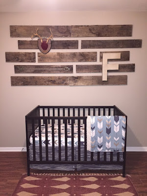
I'm going to be an aunt! My sweet sister, Haylee, is due in March and I. cannot. wait. She, the most impatient person on this Earth, also cannot wait. My nephew's nursery has been beautifully decorated and waiting for him to come play since the day after her first ultrasound. (That's a slight exaggeration but you get it.) Mr. Fischer will be a boy's boy. Hunting, fishing, all things dirt. His room is rustic chic with my sister's signature style. This made the shower invitation easy. 


I started with the color palette, and chose to pull from the colors of his bedding (purchased here). The theme would obviously be antler-based, but I also wanted to play on the delicate nature of babies themselves and so I chose a playful script. 


baby-shower-invitation

Bonus: it's perfect for monograms and nobody loves monograms more than Fischer Zachary Boyd's mom-to-be. This kid will never lose a blanket in his life. Monograms are also one of my most favorite ways to "class up the joint" as we (I) refer to it with my coworkers (no one) around the office (living room). And so, BEHOLD: the final product:


So far, it has rave reviews (from my sisters, and my mom who called it "cute" with no punctuation or emojis because why inflate your child's ego?). If you also want to purchase this invitation and leave a one word review, you may do so right here. My mom suggests "neat" or "good" in case you need ideas.

1.07.2016

DIY // Holiday Card Flipbook


It's time to clean up the Christmas decor. This used to be my least favorite thing to do. I always missed seeing the tree and feeling all the holiday vibes. This year, I've got a wandering baby who loves hazards and I was relieved to have the tree out of the way.

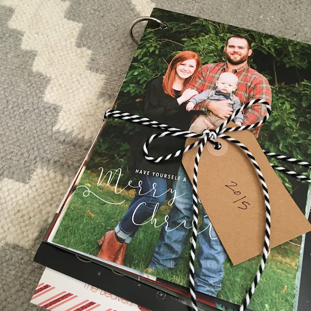
If you're like me (you are), then you've got approximately 5 million holiday cards that you don't want to throw in the trash. Something about seeing leftovers smeared all over your aunt's face just doesn't sit well. What do you do with them? They're sweet but you're out of drawer space. Enter: me. My little flipbook is perfect for holding onto these holiday moments in a much less cluttered way. Also, it takes maaaaybe 10 minutes total because TIME IS MONEY or because naps are better than crafts.


SUPPLIES // Single hole punch, binder ring, tag, pen, leftover ribbon, Christmas cards. 


STEP ONE // Aggressively punch holes in the corner of each card.

STEP TWO // Weave the binder ring through each card.
STEP THREE // Write the year on your tag and tie ribbon around it all for cuteness and storage purposes.

That's all. Stick it on a shelf or pack it away with your Christmas decor so you can look through it each year and remember how skinny everyone used to be. 


12.31.2015

Hi Internet,

As my 2016 gift to you, I've decided to start a blog. Truth be told, I meant to start this blog in 2014 when I paid someone to design it for me but they were in the UK and it took me 1.5ish years to figure out how to get the date out of the European format. (I also had a baby.) 

I don't really have a plan for this... I'm thinking I'll tell you guys about new stuff in my Etsy shop or fun projects I get to do. Because apparently you're supposed to have a BLOG for your SMALL BUSINESS to promote HANDMADE ITEMS and other buzzwords like that. (Is it handmade if you use a computer? I use my hands to click the mouse so I'm going to say yes.) I might end up just typing lots of nonsense because I miss ranting on The Duds. Either way, I'll be sure to post about new blogs on my Facebook page and then you can decide whether or not to waste your bathroom visits on me. 


x HAPPY NEW YEAR x


  • Home
  • Services
  • Work
  • Contact
  • Site photos by creative partner, Allee J Photography
    © 2014 nicole campbell creative